The Making of a Cover: Darth Vader and the Ghost Prison by Dave Wilkins
We asked Dave Wilkins to share some thoughts about his really awesome connected series of covers for the Star Wars: Darth Vader and the Ghost Prison comic series.
When the editors and I originally started to design the covers, we were talking about showing Vader in five iconic shots and how that would pertain to the Force. The Force is always referred to as “flowing,” so my initial thought was water. I did the layout as a massive wave of the dark side, and that became the unifying theme through all five covers.
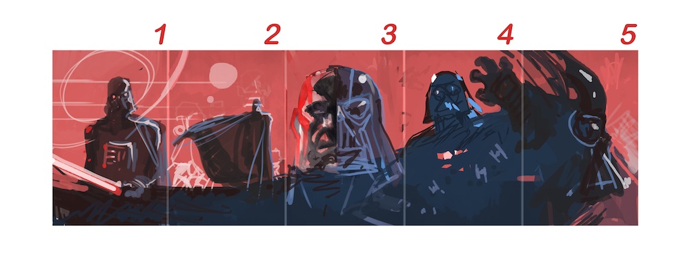
First I started with beats that reflected impactful periods of Vader's life. Then I wanted to create a balance of elements from the Sith and the Empire woven together: archaic Sith texts combined with Death Star schematics and TIE fighters flowing in and out of the background to underscore the wave motif.
 While everyone was onboard with the idea, it just didn't work for the story. This is about the beginning of Vader's career, so a lot of classic imagery was off limits (the Death Star, stormtroopers, etc.), and that sent me back to the drawing board. But then editor Randy Stradley made the suggestion to go vertical and turn the whole thing on its head. I am glad we did, because starting vertically made me think about it differently. As a result, the idea was fresh and I wasn't trying to shoehorn diluted fragments of the original concept into this new one.
We decided the best approach would be thematic: tie story-specific elements together and let them run through the covers of all five issues. I'm a huge movie buff, and obviously a Star Wars fan, so I started with what is at the core of Star Wars DNA to me personally—that opening shot of the ship in Episode IV—while drawing inspiration from Drew Struzan's amazing paintings. Basically it came down to combining those things that I love and adapting them for the opening of the series.
I kicked off cover 1 with a familiar opening shot of a cruiser approaching a planet with the menacing Vader image looming above. I wanted to set the tone that the baddest dude in the galaxy is about to pull in to a spaceport near you!
I wanted the second cover to continue like a camera pan from the films. The camera moves down to reveal Vader on the ground, lightsaber engaged and ready for action. This transition from cover 1 to 2 was relatively easy. But getting into cover 3 fluidly…not so much…
For me one of the coolest things in Star Wars is from Return of the Jedi (spoiler alert!): Vader lifts the Emperor midcombat while Force lightning is flying all around, blasting Vader and everything in the area. When the lightning makes impact with Vader, it’s like an x-ray for just a second and his skull becomes visible. I begged the guys to let me do an extreme close-up inspired by that scene. Overall I'm happy with how it turned out. It's a little creepier than I initially intended, but yeah, it was definitely fun.
-Dave Wilkins
Subscribe

Recent Posts
05-09-2024
05-08-2024
05-07-2024
05-03-2024
05-01-2024
Archive
- May 2024
- April 2024
- March 2024
- February 2024
- January 2024
- December 2023
- November 2023
- October 2023
- September 2023
- August 2023
- July 2023
- June 2023
- May 2023
- April 2023
- March 2023
- February 2023
- January 2023
- December 2022
- November 2022
- October 2022
- September 2022
- August 2022
- July 2022
- June 2022
- May 2022
- April 2022
- March 2022
- February 2022
- January 2022
- December 2021
- November 2021
- October 2021
- September 2021
- August 2021
- July 2021
- June 2021
- May 2021
- April 2021
- March 2021
- February 2021
- January 2021
- December 2020
- November 2020
- October 2020
- September 2020
- August 2020
- July 2020
- June 2020
- May 2020
- April 2020
- March 2020
- February 2020
- January 2020
- December 2019
- November 2019
- October 2019
- September 2019
- August 2019
- July 2019
- June 2019
- May 2019
- April 2019
- March 2019
- February 2019
- January 2019
- December 2018
- November 2018
- October 2018
- September 2018
- August 2018
- July 2018
- June 2018
- May 2018
- April 2018
- March 2018
- February 2018
- January 2018
- December 2017
- November 2017
- October 2017
- September 2017
- August 2017
- July 2017
- June 2017
- May 2017
- April 2017
- March 2017
- February 2017
- January 2017
- December 2016
- November 2016
- October 2016
- September 2016
- August 2016
- July 2016
- June 2016
- May 2016
- April 2016
- March 2016
- February 2016
- January 2016
- December 2015
- November 2015
- October 2015
- September 2015
- August 2015
- July 2015
- June 2015
- May 2015
- April 2015
- March 2015
- February 2015
- January 2015
- December 2014
- November 2014
- October 2014
- September 2014
- August 2014
- July 2014
- June 2014
- May 2014
- April 2014
- March 2014
- February 2014
- January 2014
- December 2013
- November 2013
- October 2013
- September 2013
- August 2013
- July 2013
- June 2013
- May 2013
- April 2013
- March 2013
- February 2013
- January 2013
- December 2012
- November 2012
- October 2012
- September 2012
- August 2012
- July 2012
- June 2012
- May 2012
- April 2012
- March 2012
- February 2012
- January 2012
- December 2011
- November 2011
- October 2011
- September 2011
- August 2011
- July 2011
- June 2011
- May 2011
- April 2011
- March 2011
- February 2011
- January 2011
- December 2010
- November 2010
- October 2010
- September 2010
- August 2010
- July 2010
- June 2010
- May 2010